Uno CSS presents a revolutionary way of creating web designs that blend speed, efficiency, and adaptability. By introducing a set of principles that prioritize a utility-first approach and Just-In-Time compilation amongst others, it sets a solid foundation for developers aiming to enhance their web projects. This article aims to unfold the layers of Uno CSS, guiding through its core concepts, setup process, and responsive design techniques to empower your web development workflow.
Understanding Uno CSS Basics
Understanding the Foundational Principles of Uno CSS
Uno CSS, a fast and efficient utility-first CSS framework, is designed to streamline the process of writing CSS by adhering to a set of foundational principles. These principles ensure developers can create responsive, visually appealing web designs quickly and with minimal effort. Here, we’ll explore the core concepts that make Uno CSS a preferred choice for web development projects.
1. Utility-First Approach
At the heart of Uno CSS lies the utility-first methodology. This approach prioritizes the use of small, composable utilities that can be combined to construct any design directly in your HTML. Unlike traditional CSS where you might define custom classes with specific styles, Uno CSS encourages you to use pre-defined utility classes. This results in faster development time as you spend less time writing CSS and more time building your interface.
2. Just-In-Time (JIT) Compilation
Uno CSS utilizes Just-In-Time compilation to generate CSS. This means it generates styles when they are needed rather than providing a vast library of unused styles. You simply use a utility class in your HTML, and Uno CSS dynamically generates the corresponding CSS at build time or on the fly. This JIT approach ensures your project only loads the CSS it uses, leading to smaller, more efficient style sheets and faster loading times.
3. Configurability and Extensibility
Despite its utility-first nature, Uno CSS is highly configurable and extensible. It comes with a default configuration that works well out of the box, but you can easily customize it to fit your project’s needs. Whether you need to define new utilities, modify existing ones, or integrate with other tools, Uno CSS offers a flexible system that adapts to your requirements. This versatility makes it suitable for a wide range of projects, from small personal blogs to large-scale enterprise websites.
4. Atomic CSS Generation
Uno CSS follows an atomic CSS generation principle. This means it breaks down styles into the smallest possible pieces – individual utility classes that serve a single purpose. For example, instead of using a comprehensive class to style a button, you would use separate utilities for color, padding, border, and more. This atomic approach promotes reusability and consistency across your project while keeping the stylesheet size to a minimum.
5. Performance Optimization
Performance is a key consideration in Uno CSS. Thanks to its JIT compilation and atomic CSS generation, it ensures that style sheets are as lean as possible. Moreover, Uno CSS is designed to generate highly optimized CSS, reducing runtime overhead and improving page load times. By focusing on performance from the ground up, Uno CSS helps developers build fast, responsive websites that deliver excellent user experiences.
Incorporating Uno CSS into your development workflow can significantly enhance efficiency, performance, and maintainability. By understanding and applying its foundational principles, developers can leverage the power of utility-first CSS to create compelling, modern web designs with ease.

Setting Up Uno CSS
Setting Up Uno CSS in Your Project
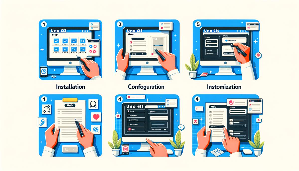
Integrating Uno CSS into your project is a straightforward process designed to enhance your development workflow with utility-first CSS principles. Here’s a step-by-step guide to get you started with Uno CSS, focusing on simplicity and efficiency.
Step 1: Install Uno CSS
Begin by installing Uno CSS into your project. Open your terminal and navigate to your project’s root directory. Execute the following command to add Uno CSS:
npm install -D unocss
This step requires Node.js to be installed on your machine. The command installs Uno CSS as a dev dependency, keeping your project’s production build lean.
Step 2: Configure Uno CSS
After installation, create a configuration file for Uno CSS. This file allows you to customize Uno CSS to suit your project’s needs. In the root of your project, create a file named unocss.config.js. Open this file in your editor and start defining your configuration:
import { defineConfig } from 'unocss'
export default defineConfig({
// Your custom configurations go here
})
This is where you can specify rules, themes, breakpoints, and other settings that Uno CSS will use to generate atomic CSS.
Step 3: Integrate With Your Build Tool
Uno CSS supports various build tools and frameworks. Integration typically involves adding Uno CSS as a plugin to your build process. For instance, if you’re using Vite, you would edit your vite.config.js file to include Uno CSS:
import UnoCSS from 'unocss/vite'
export default {
plugins: [
UnoCSS(),
],
}
Check the Uno CSS documentation for instructions tailored to other build tools like Webpack, Rollup, or even PostCSS.
Step 4: Start Using Uno CSS in Your Project
With Uno CSS installed and configured, you’re ready to start using it in your project. In your HTML or component files, begin adding Uno CSS utility classes to your elements:
Uno CSS will automatically generate and apply the corresponding CSS styles for these utilities when you build or serve your project.
Step 5: Customize and Extend
As your project evolves, you may find the need to customize or extend Uno CSS. Utilize the unocss.config.js file to add custom utilities, variants, or plugins. Uno CSS is highly customizable, allowing you to tailor it perfectly to your project’s requirements.
By following these steps, you integrate Uno CSS into your project, leveraging its utility-first approach and JIT compilation for a more efficient, maintainable, and performance-optimized development process. This guide provides a foundation, but exploring Uno CSS’s extensive documentation can offer deeper insights and advanced techniques to further enhance your experience.

Creating Responsive Designs with Uno CSS
Leveraging Uno CSS for Responsive Web Design
With the foundational steps to integrate Uno CSS into your project covered, the next phase focuses on utilizing its capabilities for responsive web design. This approach ensures your websites adapt seamlessly across various devices, enhancing user experience.
Creating Responsive Designs with Uno CSS
Uno CSS simplifies the process of making your web designs responsive, utilizing predefined utility classes that can be applied directly to your HTML elements. These are instrumental in adjusting layouts, typography, and other design elements based on the size of the user’s screen.
Step 6: Utilize Responsive Prefixes
Uno CSS’s power lies in its responsive prefixes. By prefixing utility classes with breakpoints, you can control when a specific style should be applied. For example, the prefix sm: applies a style for small screens, while lg: targets large screens. To implement, add the responsive prefix before your utility class in the HTML element.
Example
<div class="sm:text-sm lg:text-lg">
  Responsive text size.
</div>
This div will have small text on small screens and larger text on larger screens, demonstrating a basic principle of responsive design: adaptability.
Step 7: Define Custom Breakpoints
While Uno CSS provides default breakpoints, tailoring them to your project’s specific needs can enhance your responsive design further. Custom breakpoints are defined in the Uno CSS configuration file, allowing for precise control over when styles are applied.
Configuring Custom Breakpoints
    exports default {
      theme: {
        screens: {
          tablet: '640px',
          laptop: '1024px',
          desktop: '1280px',
        },
      },
    }
Customizing breakpoints allows for granular control, ensuring that your design responds accurately across devices.
Step 8: Combine Utility Classes for Complex Layouts
Responsive design often requires more than simple text adjustments. Combining various utility classes enables the creation of complex, responsive layouts with minimal effort. This method involves using grid, flex, spacing, and other layout-related utilities in conjunction with responsive prefixes.
Example
<div class="sm:grid-cols-2 lg:grid-cols-4 gap-4">
  <!-- Your content here -->
</div>
In this scenario, the div will display two columns on small screens and four columns on larger screens, efficiently using space while maintaining an organized layout.
Step 9: Test Across Devices
Lastly, it’s crucial to test your responsive designs across multiple devices and screen sizes. This step ensures compatibility and user friendliness, providing insights into potential adjustments. Utilize browser dev tools or physical devices to simulate various environments, fine-tuning your design for optimal responsiveness.
By following these steps and leveraging Uno CSS’s responsive design features, you can craft websites that look great and function flawlessly across all devices. Remember, the key to responsive design is adaptability and efficiency, both of which Uno CSS enhances significantly.

Embracing Uno CSS in your web development projects not only streamlines the process but also brings forth an era of efficiency, performance, and creativity. By understanding its foundational principles, configuring it correctly, and applying its responsive design capabilities, you unlock a vast potential to craft web designs that resonate with users across different devices. Uno CSS stands as a testament to the power of utility-first CSS, promising a future where building responsive, visually appealing websites is quicker and more intuitive than ever before.
Revolutionize your content with Writio, the AI writer that delivers top-notch articles. This post was created by Writio.


